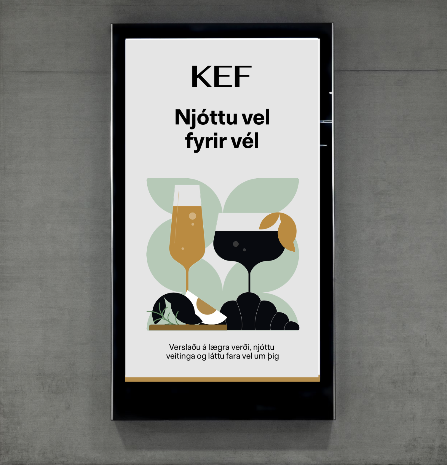
KEF
Iceland’s international airport commissioned Brandenburg for a full brand refresh, including a new visual and graphic identity.
My role: Developed KEF’s graphic language, creating a cohesive system of visual elements used across airport touchpoints. This included communication illustrations that clearly convey key information to passengers, as well as internal graphics designed for use throughout KEF’s offices and internal platforms.
Project: Full brand refresh.
Work at: Brandenburg Creative Agency.
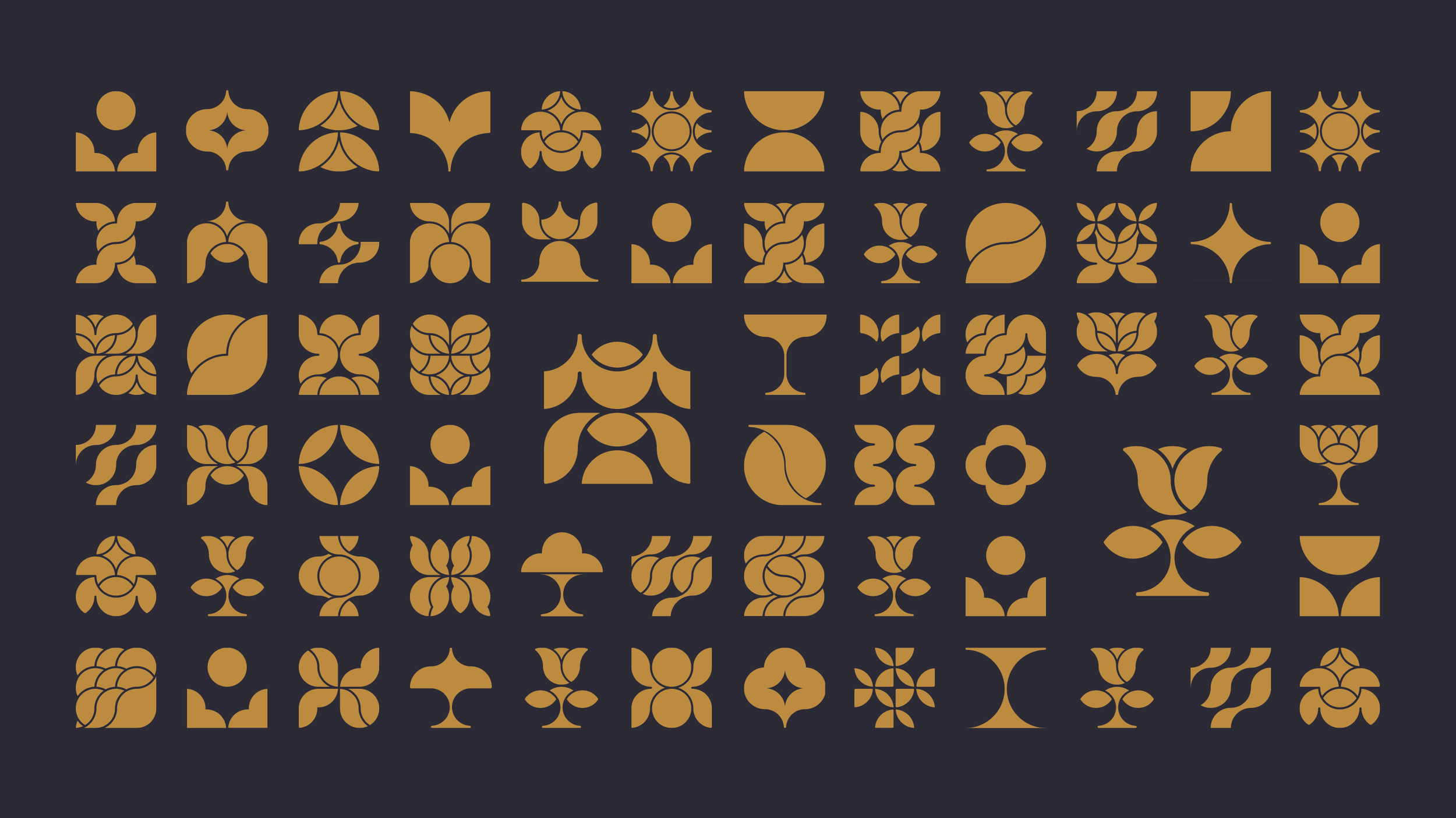
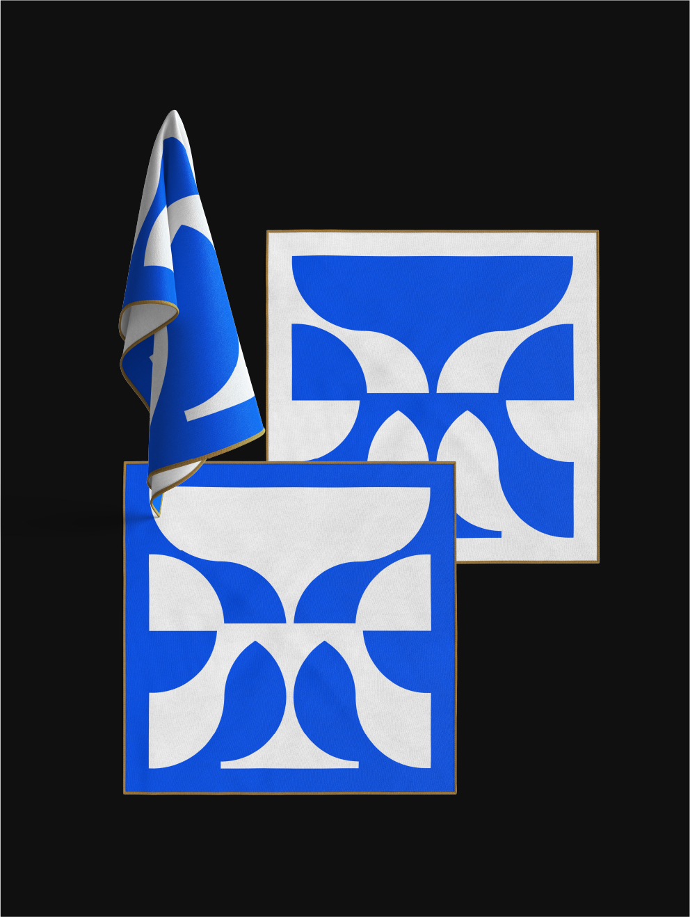
The graphic units are created in the KEF drawing grid system, which is integrated into the general KEF grid system. The grid is made up of the basic shapes of a box and a circle, but in its simplicity it refers to Icelandic formal culture, such as the Celtic symbology, Icelandic carving and handicrafts. Simple, timeless and incredibly versatile.
KEF graphic units are abstract images that are intended as decoration and are useful for various occasions. Whether the units are arranged in a pattern or used as individual units with other materials to bring them to life.

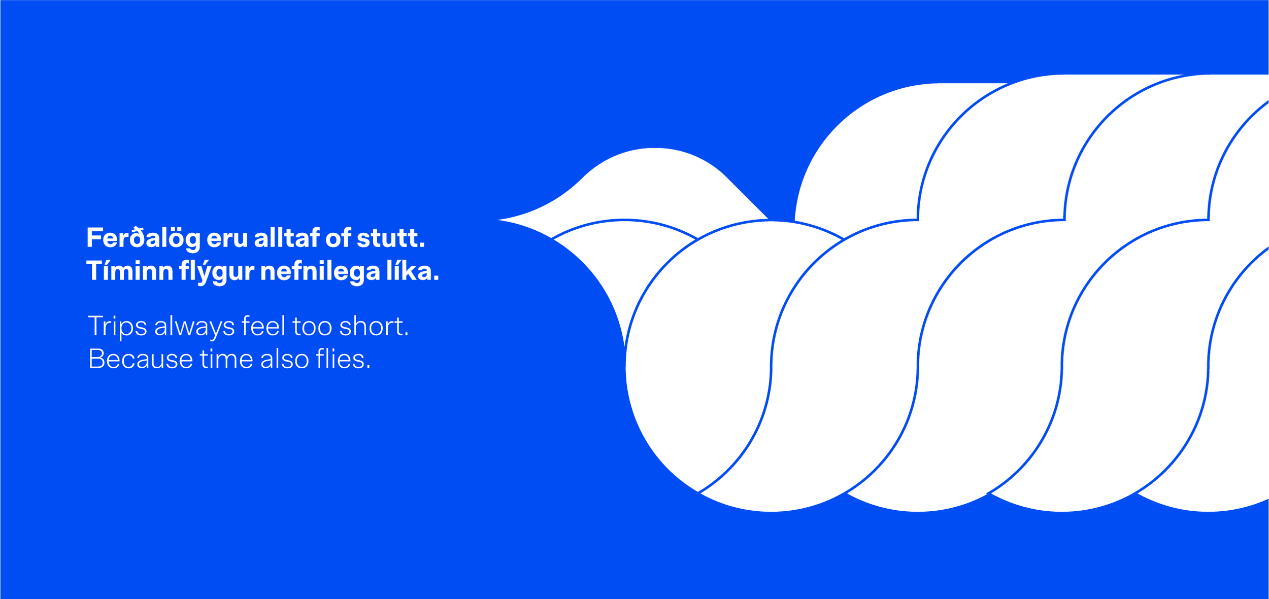

Communication Illustrations
The style is more free-form than the more formal graphic elements, but they do use the elements in the background to weave the styles together as a whole. The image descriptions are intended to replace photographs in certain cases.